Case Study 03
Prism Design System
A shared UI foundation for the CAS scientific research portfolio
Compound saved
Aspirin added to your saved list.
Save failed
Could not reach the server. Try again.
Overview
CAS operates a portfolio of scientific research tools used by researchers, chemists, and biologists worldwide. Prism is the design system that gives those products a shared visual language, component library, and accessibility foundation, built with Angular 18, a portable CSS token layer, and a deliberate engineering workflow designed to move fast without accruing design debt.
Challenge
- A $500M+ product portfolio with no shared UI foundation. Every product team made independent decisions on color, spacing, type, and interaction patterns.
- Accessibility was inconsistent and reactive, addressed per-product after the fact rather than enforced at the system level.
- No single source of truth for components meant designers and engineers built the same patterns multiple times across SciFinder, BioFinder, Newton, and more.
- Onboarding engineers to a new product required re-learning UI conventions instead of reaching for a trusted, documented library.
Accessibility
Accessibility in Prism isn't a checklist item. It's a structural constraint built into the system at every layer. The goal was WCAG 2.1 AAA from the start, which meant the decisions had to be made upstream, in the token architecture and component API design, not patched in after the fact.
Token-enforced contrast
Every visual value (color, spacing, type scale) lives in CSS custom properties. No hardcoded hex anywhere in the library. Because contrast ratios are set once in the token layer and inherited everywhere, AAA compliance isn't something individual engineers have to remember: it's already true by the time they reach for a component.
24 brand tokens across 4 scales: blue, cyan, yellow, grey. Contrast ratios are enforced at the token definition, not the component.
Proprietary CAS iconography ships as part of Prism — each icon available in filled and line variants, rendered via SVG with currentColor so they inherit the token-driven ink color automatically.
Component API decisions for screen readers
Buttons use isDisabled + aria-disabled="true" rather than native disabled. Native <button disabled> removes the element from the accessibility tree entirely. A screen reader user can't discover the button exists. Form controls use native disabled because <input disabled> is announced correctly. The asymmetry is deliberate, documented, and enforced. This kind of decision, made once at the system level, is what a design system exists to prevent having to make forty times across forty components.
All four variants share the same token architecture. The disabled state uses aria-disabled="true", preserving the element in the accessibility tree, rather than the native disabled attribute.
Automated runtime testing
Every component ships with a Storybook story. The test runner executes axe-core against every story on each CI pass, gated at WCAG 2.1 AA by default with a configurable A11Y_LEVEL flag to tighten to AAA. Violations block the build. The per-component accessibility snapshot is regenerated on every dev startup so the baseline stays current.
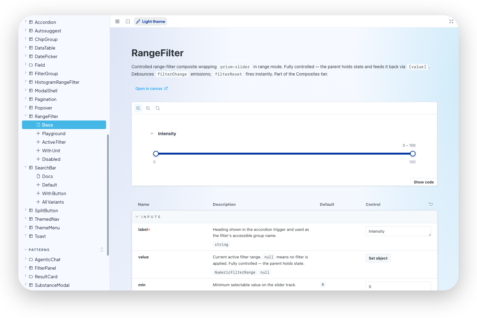
Storybook serves as the source of truth for every component. API docs are auto-generated from source via Compodoc
Static analysis on Angular templates
Custom ESLint rules catch accessibility violations at the template level before runtime, including missing aria-label attributes on icon-only buttons and ViewEncapsulation violations. Catching these statically means they never reach Storybook, never reach review, and never reach production.
Engineering Velocity
The accessibility foundation only creates velocity if the system is fast to build with, fast to iterate on, and fast to adopt. Prism was designed with that constraint in mind from the start: not just what the components do, but how they're authored, tested, and delivered.
AI-assisted component generation
The Angular library was generated by Claude from the original React and Tailwind components. This wasn't a one-shot dump. It was a supervised translation that preserved component intent and API shape while targeting Angular 18 conventions: standalone components, host: metadata, content projection. The result compressed what would have been months of porting work into a reviewable, iterable output. Forty-two components, shipped.
Token-first architecture
One SCSS source compiles to CSS custom properties and a W3C Design Tokens JSON file simultaneously. A single change to the token layer propagates everywhere — light and dark mode, every component, every product. No per-component dark mode overrides, no manual sync between Figma and code. Dark mode is a data attribute: data-theme="dark" on any ancestor flips all tokens automatically.
Seven tokens in Plus Jakarta Sans cover every surface. The 12px caption floor meets WCAG 2.1 AAA for small text. No size is hardcoded.
CAS RN®
50-78-2Acetylsalicylic acid
CAS RN®
58-08-2Caffeine
CAS RN®
50-78-2Acetylsalicylic acid
CAS RN®
58-08-2Caffeine
One token change flips every surface. Light and dark mode share the same component code — only the CSS custom property values change.
Automated quality gates
npm run test chains lint, story coverage, story controls audit, and unit tests. The story controls auditor runs seven checks across all 42 story files to catch drift between component inputs and Storybook argTypes. Visual regression runs via Playwright against a locked baseline. These gates run in CI on every push — velocity doesn't come at the cost of quality.
Pre-push discipline without ceremony
A pre-commit hook enforces version bumps whenever the publishable surface changes. A /pre-push slash command walks contributors through the checklist interactively. The goal was to make doing it right the path of least resistance, not a separate workflow.
Collaboration & Adoption
A design system only creates value when teams actually use it. Prism was built with adoption as a design constraint — the documentation, tooling, and token formats are all optimized for the moment a new engineer or designer reaches for the system.
Storybook as the contract
Storybook is the source of truth for every component's API, states, and behavior. Compodoc feeds the args table automatically from JSDoc on every input and output, so the documentation stays in sync with the code without a separate authoring step. Every component has an Overview, Props, and Code tab. Designers and engineers see the same artifact.
CAS RN®
50-78-2Acetylsalicylic acid
Every visual property on a Prism component traces back to a named token. Engineers consume the API; the token layer owns the design decision.
W3C tokens as a Figma bridge
The token layer ships in two formats: CSS custom properties for Angular consumers and a W3C Design Tokens JSON file for tooling. The JSON feeds directly into Figma Variables, which means the design token source of truth in code and in Figma stays synchronized without manual handoff. When a token changes, both sides update from the same file.
Consumer onboarding
A CONSUMER-CLAUDE.md file ships alongside the library — a drop-in for downstream product teams that prevents AI assistants from making design decisions outside the system: no hardcoded hex, no off-token spacing, no component modifications that bypass the library. The onboarding doc for a new CAS product team includes this file alongside the install instructions.
CAS products as proof
Prism serves SciFinder, BioFinder, Newton, IP Finder, Analytical Methods, and Formulus. Each ships consistent interaction patterns, matching token-derived color and type, and the same keyboard navigation and screen reader behavior — without each team owning that work independently.
Gallery
CAS Draw is the structure-editing tool built on Prism. Every surface, button, and input in the toolbar uses a real Prism component — the same glass surfaces, token layer, and accessibility patterns that power the full CAS product portfolio.
The full conversation interface — user bubbles, AI responses, and the loading wait state — renders using glass-tinted-cas, glass-input, and the same btn-glass-* variants used throughout the CAS product suite.
Reflection
The hardest part of building a design system isn't the components. It's convincing the organization that the cost of building the system is worth paying before the problems it prevents have become painful enough to feel urgent. Prism got built because the CAS portfolio had grown large enough that the inconsistency was becoming measurable: in engineering hours, in accessibility debt, in the friction of onboarding someone new onto a product whose UI conventions lived only in the heads of the people who'd built it.
The AI-assisted implementation was a deliberate choice, not a shortcut. Porting forty-two components from React and Tailwind to Angular 18 by hand would have taken months and produced the same artifact. What the AI acceleration bought was time to spend on the decisions that actually mattered: the token architecture, the accessibility constraints, the API shapes that would be stable enough for six products to depend on.